Design system
Frontend architecture
NPM · Angular · Vue
I built the design system because the alternative was chaos.
Managing UI components across multiple products without a shared system means every designer solves the same problem differently, every developer rebuilds the same component from scratch, and every product drifts further from every other. I designed and built Vision from the ground up — a component library shipped as a Figma kit and three published frontend libraries.

Role
Sole architect — concept,
design, build, publish
Deliverables
Figma kit · NPM · Angular · Vue
Outcome
50% reduction in design and development time
Used across:
Used across all digital products
in platform & portfolio
01 - The Problem
As the product portfolio grew, so did the inconsistency. Buttons looked slightly different across products. Form fields had different padding on different platforms. A developer on one project would build a tab component that another project had already built three months earlier — differently.
The problem wasn't skill. It was the absence of a shared contract between design and engineering. Vision was built to be that contract.
02 - The atomic structure
Vision follows atomic design methodology — not because it's fashionable, but because it maps directly to how frontend components are actually built. A button (atom) goes into a search field (molecule) which goes into a navigation header (organism) which goes into a product page. Change the button token and it propagates everywhere. That's the point.
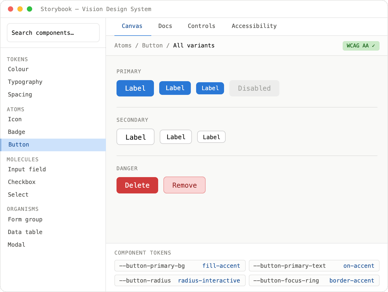
Atoms — the visual contract
Colour tokens, typography scale, spacing, radius, shadow, icon set, button variants, form controls, badges, avatars. Every design decision that needs to be consistent across products lives here. Change it once, change it everywhere.

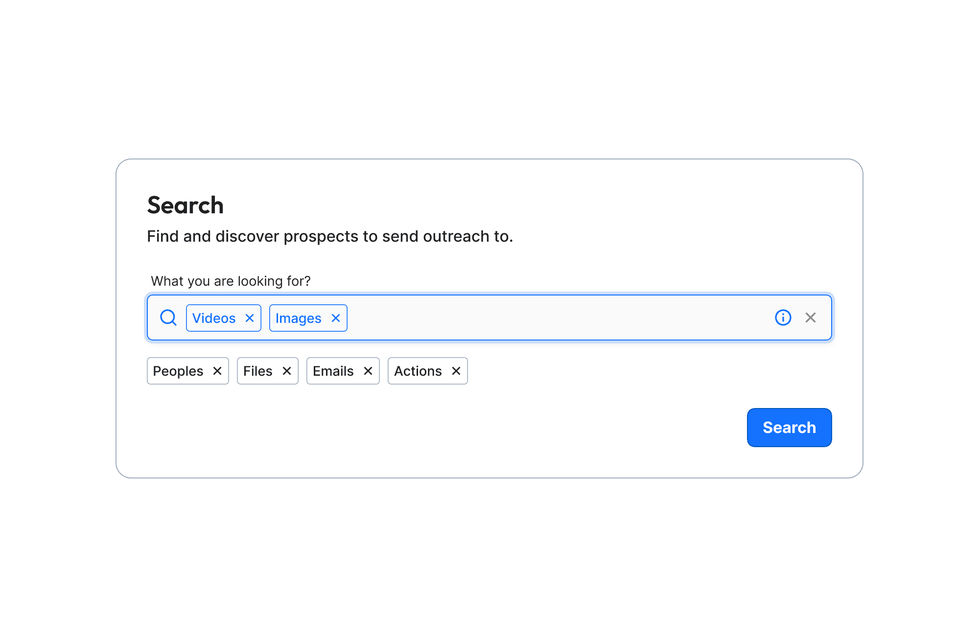
Molecules — functional units
Atoms grouped into components that do one job. Stepper, button group, tab group, file upload field, date picker. Each molecule owns its own states — hover, focus, error, disabled — so neither designer nor developer needs to define them again at the organism level.

Organisms — interface sections
Molecules assembled into complete interface sections. Navigation headers, asset map views, search panels. These are what engineers pull directly from the library — not individual buttons, but fully composed interface blocks ready to drop into a product.


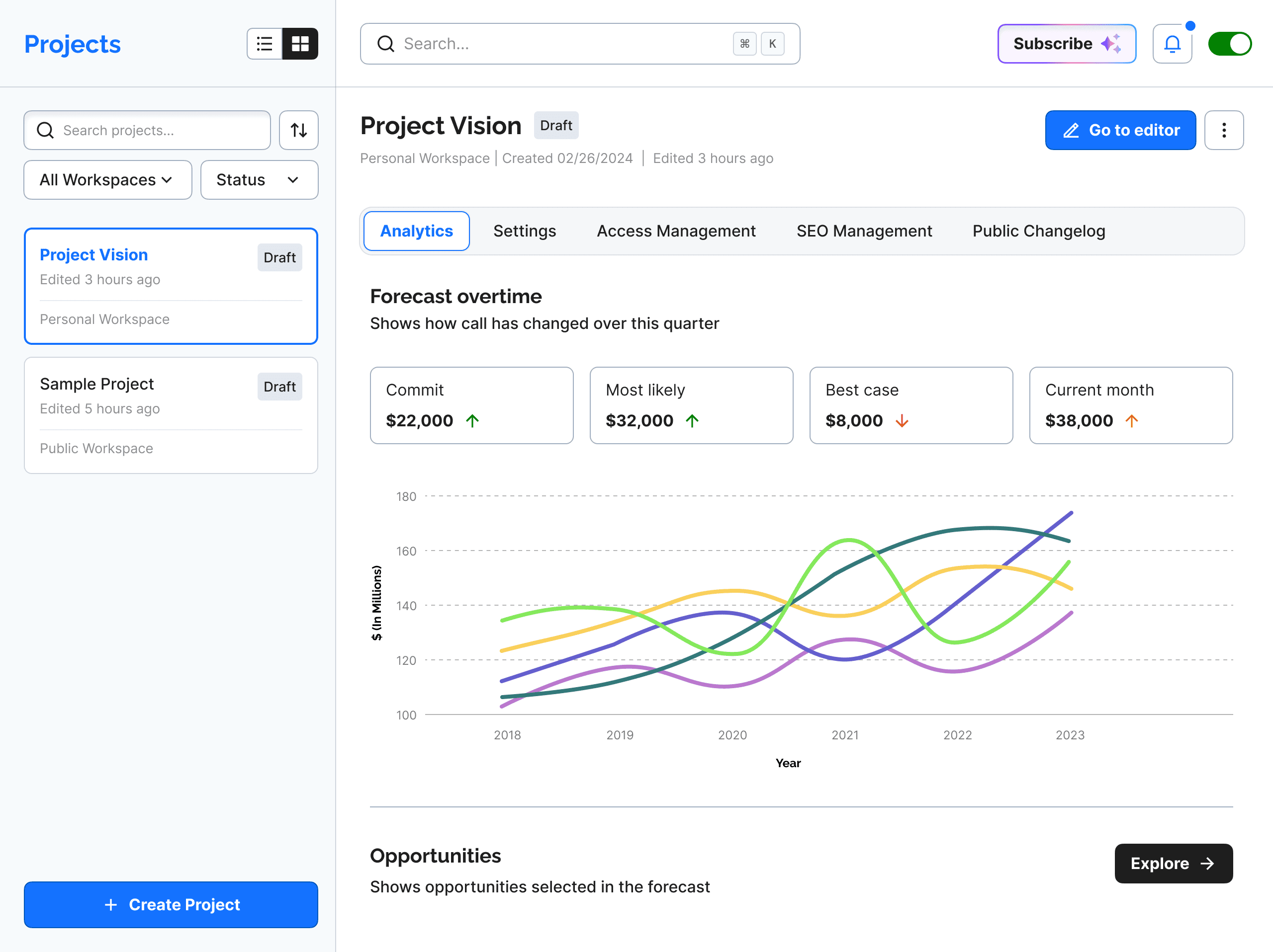
Pages — the system in production
Where the system proves itself. Every screen in every product is built from organisms — which are built from molecules — which are built from atoms. A new product page is an assembly job, not a design job. That's what a 50% time reduction looks like in practice.



03 - The decision worth remembering
The hardest part of building a design system isn't the components — it's adoption. A system nobody uses is a folder of Figma files.
Publishing Vision as actual installable libraries (NPM, Angular package, Vue package) was the decision that forced adoption. When a developer can run one command to get the latest button component, they stop building their own. When the Figma kit auto-updates tokens, designers stop drifting. The system becomes the path of least resistance — which is the only way a design system actually works.
04 - Results
50% reduction in design and development time across all products using the system. One consistent visual language across every product in the portfolio. Three published libraries — NPM, Angular, Vue — maintained and updated from a single source of truth.
The system is still the foundation every subsequent project in this portfolio was built on.
NEXT PROJECT
Failure Triage AI Agent
View
Design system
Frontend architecture
I built the design system because the alternative was chaos.
Managing UI components across multiple products without a shared system means every designer solves the same problem differently, every developer rebuilds the same component from scratch, and every product drifts further from every other. I designed and built Vision from the ground up — a component library shipped as a Figma kit and three published frontend libraries.
Role
Sole architect - concept, design, build, publish
Deliverables
Figma kit · NPM · Angular · Vue
Outcome
50% reduction in design and development time
Used across:
Used across all digital products in platform & portfolio
01 - The Problem
As the product portfolio grew, so did the inconsistency. Buttons looked slightly different across products. Form fields had different padding on different platforms. A developer on one project would build a tab component that another project had already built three months earlier — differently.
The problem wasn't skill. It was the absence of a shared contract between design and engineering. Vision was built to be that contract.
02 - The atomic structure
Vision follows atomic design methodology — not because it's fashionable, but because it maps directly to how frontend components are actually built. A button (atom) goes into a search field (molecule) which goes into a navigation header (organism) which goes into a product page. Change the button token and it propagates everywhere. That's the point.
Atoms — the visual contract
Colour tokens, typography scale, spacing, radius, shadow, icon set, button variants, form controls, badges, avatars. Every design decision that needs to be consistent across products lives here. Change it once, change it everywhere.
Molecules — functional units
Atoms grouped into components that do one job. Stepper, button group, tab group, file upload field, date picker. Each molecule owns its own states — hover, focus, error, disabled — so neither designer nor developer needs to define them again at the organism level.
Organisms — interface sections
Molecules assembled into complete interface sections. Navigation headers, asset map views, search panels. These are what engineers pull directly from the library — not individual buttons, but fully composed interface blocks ready to drop into a product.
Pages — the system in production
Where the system proves itself. Every screen in every product is built from organisms — which are built from molecules — which are built from atoms. A new product page is an assembly job, not a design job. That's what a 50% time reduction looks like in practice.
03 - The decision worth remembering
The hardest part of building a design system isn't the components — it's adoption. A system nobody uses is a folder of Figma files.
Publishing Vision as actual installable libraries (NPM, Angular package, Vue package) was the decision that forced adoption. When a developer can run one command to get the latest button component, they stop building their own. When the Figma kit auto-updates tokens, designers stop drifting. The system becomes the path of least resistance — which is the only way a design system actually works.
04 - Results
50% reduction in design and development time across all products using the system. One consistent visual language across every product in the portfolio. Three published libraries — NPM, Angular, Vue — maintained and updated from a single source of truth.
The system is still the foundation every subsequent project in this portfolio was built on.
NEXT PROJECT
Failure Triage AI Agent
View
Design system
Frontend architecture
NPM · Angular · Vue
I built the design system because the alternative was chaos.
Managing UI components across multiple products without a shared system means every designer solves the same problem differently, every developer rebuilds the same component from scratch, and every product drifts further from every other. I designed and built Vision from the ground up — a component library shipped as a Figma kit and three published frontend libraries.
Role
Sole architect — concept,
design, build, publish
Deliverables
Figma kit · NPM · Angular · Vue
Outcome
50% reduction in design and development time
Used across:
Used across all digital products
in platform & portfolio
01 - The Problem
As the product portfolio grew, so did the inconsistency. Buttons looked slightly different across products. Form fields had different padding on different platforms. A developer on one project would build a tab component that another project had already built three months earlier — differently.
The problem wasn't skill. It was the absence of a shared contract between design and engineering. Vision was built to be that contract.
02 - The atomic structure
Vision follows atomic design methodology — not because it's fashionable, but because it maps directly to how frontend components are actually built. A button (atom) goes into a search field (molecule) which goes into a navigation header (organism) which goes into a product page. Change the button token and it propagates everywhere. That's the point.
Atoms — the visual contract
Colour tokens, typography scale, spacing, radius, shadow, icon set, button variants, form controls, badges, avatars. Every design decision that needs to be consistent across products lives here. Change it once, change it everywhere.
Molecules — functional units
Atoms grouped into components that do one job. Stepper, button group, tab group, file upload field, date picker. Each molecule owns its own states — hover, focus, error, disabled — so neither designer nor developer needs to define them again at the organism level.
Organisms — interface sections
Molecules assembled into complete interface sections. Navigation headers, asset map views, search panels. These are what engineers pull directly from the library — not individual buttons, but fully composed interface blocks ready to drop into a product.
Pages — the system in production
Where the system proves itself. Every screen in every product is built from organisms — which are built from molecules — which are built from atoms. A new product page is an assembly job, not a design job. That's what a 50% time reduction looks like in practice.
03 - The decision worth remembering
The hardest part of building a design system isn't the components — it's adoption. A system nobody uses is a folder of Figma files.
Publishing Vision as actual installable libraries (NPM, Angular package, Vue package) was the decision that forced adoption. When a developer can run one command to get the latest button component, they stop building their own. When the Figma kit auto-updates tokens, designers stop drifting. The system becomes the path of least resistance — which is the only way a design system actually works.
04 - Results
50% reduction in design and development time across all products using the system. One consistent visual language across every product in the portfolio. Three published libraries — NPM, Angular, Vue — maintained and updated from a single source of truth.
The system is still the foundation every subsequent project in this portfolio was built on.
NEXT PROJECT
Failure Triage AI Agent
View