Automotive
Connected mobility
Enterprise IoT
One dashboard.
Eight integrated systems.
One vehicle, three readers.
led design for a connected-vehicle platform that translated raw telemetry into decisions — for drivers who've never popped the hood, for service centers deciding who to call, and eventually for fleet managers watching dozens of vehicles at once.

Role
Lead UX + Frontend +
Mobile development
Platform
iOS · Android · Web
Client
Enterprise · Oil & Gas
Team
5–7 designers led, 25+ mentored
01 - The Problem
Most car owners don't want more data. They want to know if something's wrong.
An automotive enterprise wanted to bring more customers into their service centers — not by advertising harder, but by helping people actually understand their own vehicle. The product was the relationship: a connected app that made sense of what the car was already telling them.
For someone who's never opened the hood, the entire product came down to one question: is my car okay right now, and what should I do about it?
The complication — a vehicle doesn't speak in plain language. It speaks in fault codes, sensor thresholds, and raw GPS traces. Somebody has to translate.
02 - What I built
Not one app. One ecosystem.
The product connected to eight-plus external systems, each with its own data shape and its own failure modes — and had to feel like a single, calm experience regardless of what was happening underneath.
01
OBD-II Bluetooth onboarding
02
Maintenance & diagnostics
03
Trips & driver score
04
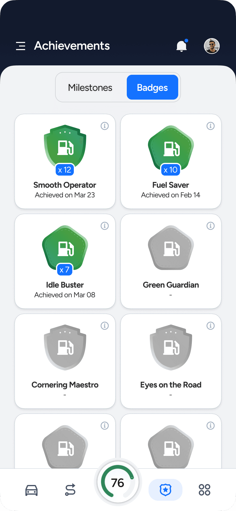
Milestones & badges
05
Emissions testing
06
Roadside assistance
07
Geofencing & place detection
08
Voice assistance
09
Digital glovebox
10
Vehicle insurance scoring
11
Nearby services & search
12
Coupons & promotions


Diagnostics, maintenance, and battery — surfaced the moment they need attention
Every one of the twelve services above eventually collapses into the same home screen: a status a driver can read in under two seconds, not a settings panel they have to interpret.
Diagnostics, maintenance, and battery — surfaced the moment they need attention
Every one of the twelve services above eventually collapses into the same home screen: a status a driver can read in under two seconds, not a settings panel they have to interpret.
Diagnostics, maintenance, and battery — surfaced the moment they need attention
Every one of the twelve services above eventually collapses into the same home screen: a status a driver can read in under two seconds, not a settings panel they have to interpret.
Diagnostics, maintenance, and battery — surfaced the moment they need attention
Every one of the twelve services above eventually collapses into the same home screen: a status a driver can read in under two seconds, not a settings panel they have to interpret.
The product connected to eight-plus external systems, each with its own data shape and its own failure modes — and had to feel like a single, calm experience regardless of what was happening underneath.
Not one app. One ecosystem.
01
OBD-II Bluetooth onboarding
02
Maintenance & diagnostics
03
Trips & driver score
04
Milestones & badges
05
Emissions testing
06
Roadside assistance

07
Geofencing & place detection
08
Voice assistance
09
Digital glovebox
10
Vehicle insurance scoring
11
Nearby services & search
12
Coupons & promotions
The product connected to eight-plus external systems, each with its own data shape and its own failure modes — and had to feel like a single, calm experience regardless of what was happening underneath.
Not one app. One ecosystem.
01
OBD-II Bluetooth onboarding
02
Maintenance & diagnostics
03
Trips & driver score
04
Milestones & badges
05
Emissions testing
06
Roadside assistance
07
Geofencing & place detection
08
Voice assistance
09
Digital glovebox
10
Vehicle insurance scoring
11
Nearby services & search
12
Coupons & promotions
Diagnostics, maintenance, and battery — surfaced the moment they need attention
Every one of the twelve services above eventually collapses into the same home screen: a status a driver can read in under two seconds, not a settings panel they have to interpret.
Signal 01 — Translation
A score that diagnoses, not judges
Driver Score was never one number to interpret. It's a breakdown — behaviour, safety, efficiency — so a driver can see exactly which habit is moving the needle, and watch it change month over month instead of guessing why a single digit went down.
Score breakdown — efficient driving vs. safe driving, tabbed by behaviour / safety / efficiency
Trend view — daily score history, total miles driven, personal best
Design decision — the score is a diagnosis, not a verdict. Splitting it into dimensions turned a passive number into something a driver could actually act on.
The score followed you, not the other way around
Driver Score sat as a persistent gauge in the bottom navigation — always visible, one tap from any screen. It wasn't a report you had to go find; it was a number that lived alongside the app itself, the same way a fuel gauge lives on a dash.
The score wasn't a black box
The gauge and the trip log were the same data, two zoom levels apart. A driver could see why Thursday's trip dropped their score — two harsh accelerations, one speeding event, one phone pickup — rather than just watching a number move for no visible reason. Making the events traceable to the score was what turned Driver Score from a mystery metric into something people trusted enough to act on.

Status Ring: Family updates

Home screen - All in one dashboard
Signal 02 — Motivation
Progress people actually want to check
Teenagers don't respond to rules. They respond to progress. I designed a goal-setting flow using a conversational format — instead of a dropdown form, teenagers build their goal like a sentence: "I want to reduce speeding by 10% for the next 15 trips." The system suggests goals based on actual driving patterns, making them feel personal rather than imposed.

Setting up a Goal
Beyond goal-setting: a Learning Center with personalised course recommendations, a Driver Score with breakdown by behaviour, milestone badges, and real-world rewards (fuel coupons for safe driving streaks).


Gamification
Goal 3
Turn raw trip data into decisions
Trips are only useful if they're contextualised. I designed an automatic classification system that categorises each trip by purpose and location — once you name "2231 Market St" as home, every future trip there is filed correctly. The result: meaningful weekly insights instead of a raw log of GPS coordinates.

Trips Insights - Single trip - Add to Place
The product connected to eight-plus external systems, each with its own data shape and its own failure modes — and had to feel like a single, calm experience regardless of what was happening underneath.
Not one app. One ecosystem.
01
OBD-II Bluetooth onboarding
02
Maintenance & diagnostics
03
Trips & driver score
04
Milestones & badges
05
Emissions testing
06
Roadside assistance
07
Geofencing & place detection
08
Voice assistance
09
Digital glovebox
10
Vehicle insurance scoring
11
Nearby services & search
12
Coupons & promotions
04 - One design decision worth remembering
The goal creation form was the wrong solution.
The original approach was a standard form: dropdown to select the driving event, text field to enter a target percentage. It worked technically but created no engagement — users set a goal and forgot it. Replacing the form with a conversational sentence builder ("I want to reduce speeding by 10% for the next 15 trips with sensitivity level strict") changed the interaction from data entry to self-reflection. Users who wrote the goal themselves understood it — and stuck to it.

UX approach


05 - Outcomes
The product launched across iOS and Android. Three additional enterprise clients adopted the same platform, adapted for their fleet contexts. The admin portal gave the client's management team real-time driver behaviour visibility across their organisation for the first time.
Thoughts - What I'd do differently
If I were designing GearUp today, I'd add an AI layer to the goal suggestions — not just pattern-based, but predictive. "Your harsh braking events increase 40% on Thursday evenings — want to set a goal around that?" That's the version of this product I'd want to design next — a risk score card that shows the signals behind the score, an alert anatomy that explains why it fired, not just that it did. These aren't features I built. They're the questions GearUp left me with.